Aeskulap Website

case study
case study
case study
Project Overview
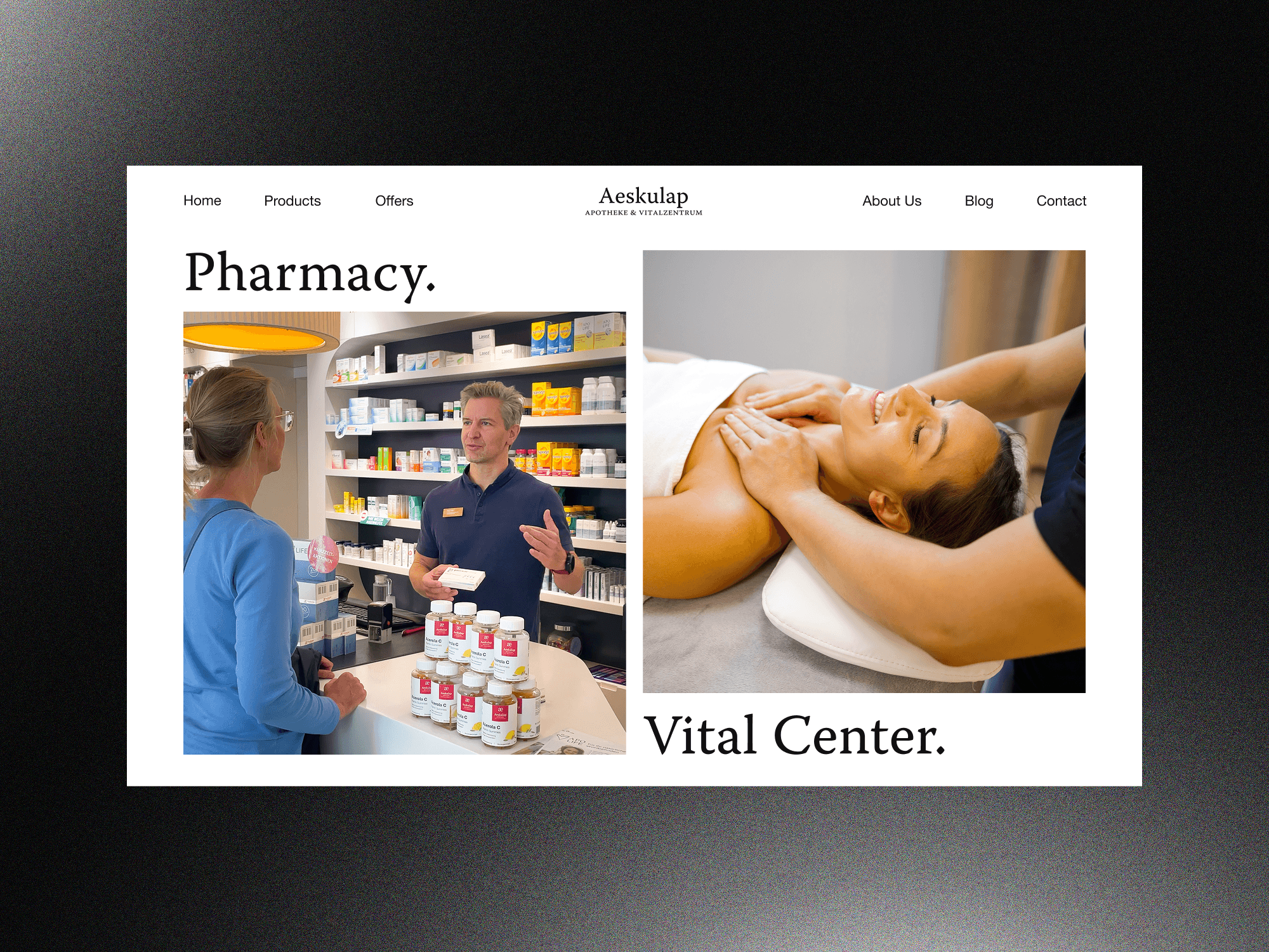
Aeskulap had evolved from a traditional pharmacy into a broader healthcare business offering both pharmacy and vitality services. We redesigned its website to accurately represent both areas while keeping them clearly separated.
Content Strategy
Content Design
Imagery & Art Direction
Page Layouts
Interactive Elements
Responsive Design
Accessibility


Starting Point
Aeskulap’s previous website was around 20 years old and represented only the pharmacy. It no longer reflected the business, its expanded services or the expectations of modern users.

Project Outcome
The redesigned website accurately represents Aeskulap as both a pharmacy and vitality centre, giving each area the space and visibility it requires.

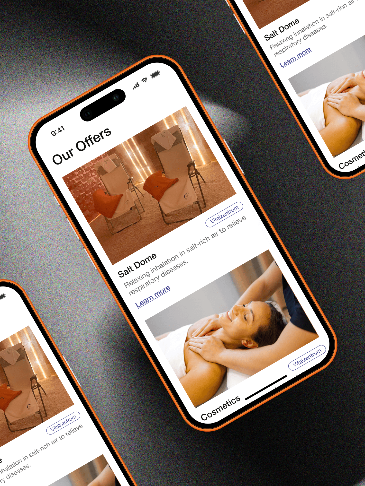
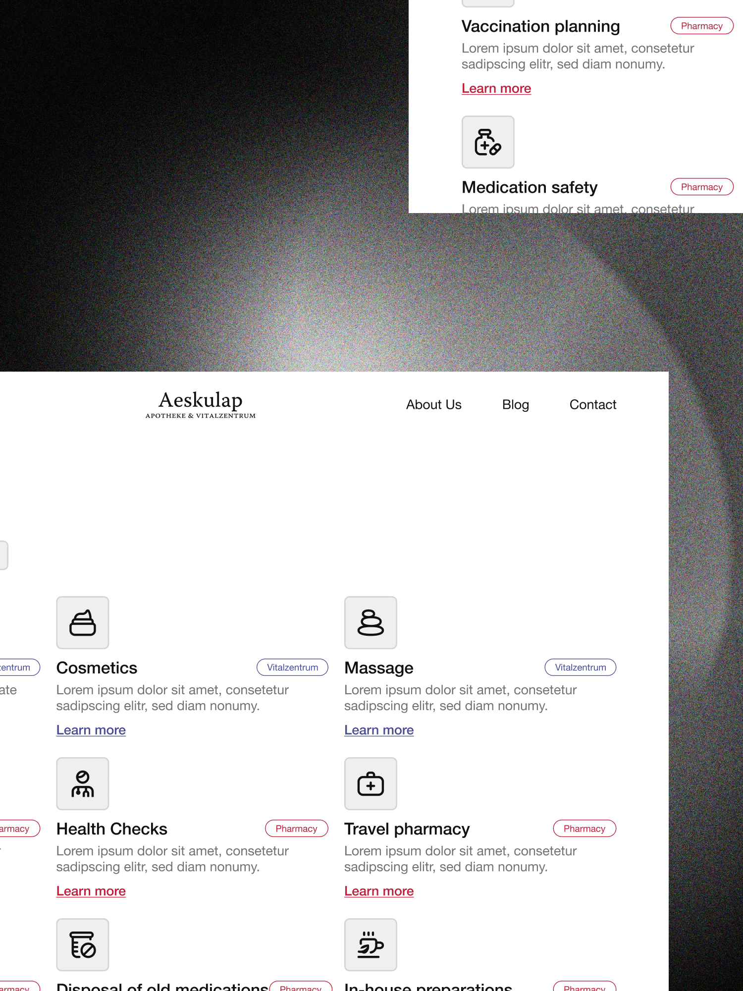
A dedicated color system separates the two service areas throughout the website while preserving one recognizable and cohesive business identity.


Improved navigation, guided recommendations and integrated support help users reach relevant products, services and information more efficiently.


Key Features
Three features help users navigate two service areas, find recommendations and access support more easily.

Guides users to relevant recommendations.
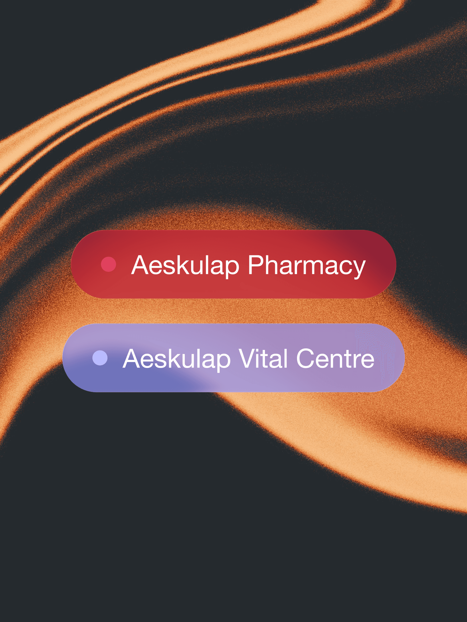
Separates pharmacy and vitality centre clearly.

Provides quick support across the website.
Project Impact
The redesign gives Aeskulap a modern digital presence that reflects how the business has developed over the past two decades. Users can now clearly distinguish between pharmacy and vitality services while accessing both through one consistent website.
Modern healthcare presence
Two clearly separated areas
Unified business identity
Guided service discovery
Faster access to support
Consistent responsive design
Similar project
